- June 6, 2022
- Posted by: TechTAR Solutions
- Categories: Dashboard, Visualization

Hello, and welcome back!
In this blog, I’d want to share my top color tips for designing and improving any Power BI or Excel dashboard.
1. Color coordination: Our most recent favorite color palette resource: https://mycolor.space/
Other options include:
2. Background is important!
- GREY
The combination of a white visual background with shadow and a very light grey report background is perhaps the safest bet. You could try the following “greys”:
#F0F1F4 #EFF3F8 #F3F3F7 #F0F3F7 #F0F4F9 #F5F7FA - DARK
A dark background might help to raise your report, but it must be contrasted. Consider first seeing how the color looks on black (i.e. color-hex.com). You might also experiment with different hues to create layers. - MAKE IT YOURSELF
You can also create your own background, which will help to structure the report. It is especially beneficial when you have a company theme and want to maintain consistency across multiple pages. Make it in Photoshop or PowerPoint!
3. Visuals
When a new report is provided, the first thing people do is look for clues and anchors. Colors are vital in this process, and it is critical to maintain consistency in the informal color legend in order to assist users.
Compare these two graphs. The orange color represents beef in the donut chart and pork in the bar chart on the left. On the right, Orange is solely used for Pork in both the Donut and Bar charts.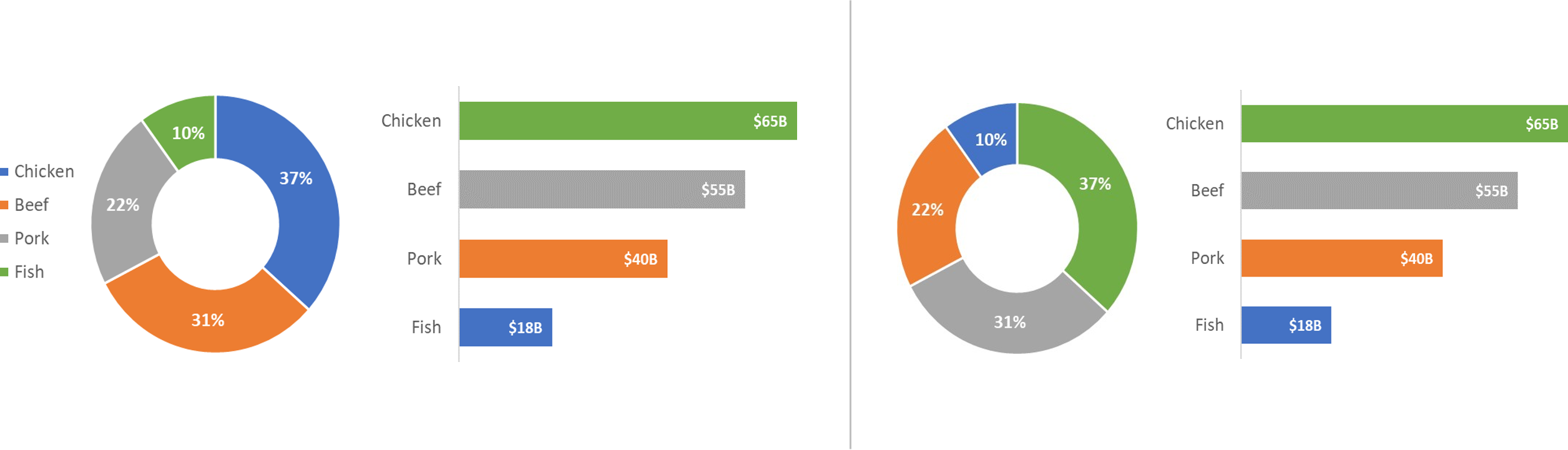
Hence By using the same colors constantly, you may remove the legend while still understanding the charts.
4. Make your own theme and export it.
If you wish to reuse the theme in the future, save it as a JSON file in Power BI and XLTX in Excel !! Take note of the sentiment colors, since they should also complement your color scheme.
I hope this was useful.