- October 22, 2022
- Posted by: TechTAR Solutions
- Categories: Dashboard, Visualization

Many people believe that to create stunning Dashboards, you must be a Designer. But… If it had to be that way, I wouldn’t be here writing about it.
You may have done the most amazing work in the world on Power BI and Excel related to ETL, Calculations, Modeling, and so on, but if you don’t know how to attract attention and impress yout audience while also conveying information to them, all of your efforts will be meaningless. This is where data visualization and storytelling come into play.
In this blog, I’ll give you a step-by-step guide to creating visually appealing Dashboards that make people go “WOW.”
8 recommendations for a successful dashboard
Creating visually appealing dashboards is easier than we think. You don’t have to be a designer to grab the interest of users with your Dashboards. Simply follow the 8 steps outlined below, and you will be able to create incredible solutions as well:
- Identify your audience and purpose;
- Sketch an outline;
- Choose the appropriate looks (layout);
- Choose a theme and maintain consistency;
- Create a personalized background;
- Use icons and images to provide context.
- Arrange visuals and write with care.
- Use references to get ideas.
I’ll go over each one separately below.
1. Identify your audience and purpose
Storytelling is central to human existence (Anthropologists)
We can define data storytelling as the art of creating a narrative around a set of data in order to convey the meaning of that data in a powerful and engaging way. This adds up to:
- Draw attention to yourself;
- Improve comprehension;
- Make a lasting impression.
In the context of the Dashboard, keep in mind that the audience will not be limited to a single type of profile. Different users have different goals and perspectives. To get a better understanding of the purpose you can begin by asking questions.
You can use this checklist of questions to understand the purpose.
- What are the primary goals and objectives of the business?
- Who is the primary audience for the dashboard?
- What is your connection to your audience?
- What problems (key performance indicators – KPIs) should we solve with the data?
- Does it make sense to separate the analyses on different pages based on the user’s profile?
Remember Each dashboard should be tailored to a specific audience, and address their specific needs
2. Sketch an outline
After the audience is known, it is important to sketch an outline of the outcome desired by the client. The goal here is to determine which data and which graph will be displayed in each position.
You’re probably thinking, “How am I going to draw this?” Well, as a consultant, I used paper even though I couldn’t draw. However, you can use the resources listed below to digitally sketch.
Answering a few key questions can help you direct your design:
- Which reports / KPIs are considered the most important? Because?
- What are the main dimensions to be used for analysis for each Report / KPI?
- Will scenario analysis (What-if) be required?
- Will the dashboard/report be exported to PDF? What size screen will it be displayed on?
- Is there a color palette to follow (company or client)? Are there any colorblind users in the group?
- Does it make sense to separate the analyses on different pages based on the user’s profile?
- What level of detail do you want to analyze each metric? Is it necessary to use the drill down?
Most people read from left to right.

A useful tip for visual layout that I always follow is to place the most important visuals at the top of the page! With no other attention triggers, the user will begin viewing the page in the upper left region of the screen (1), which is where you should put the most important information on your dashboard! He will then shift his gaze to the top right (2), bottom left (3), and bottom right (4). Consider the letter “Z.” (zigzag).
3. Choose the appropriate looks (layout)
In Dashboard Design and Storytelling, creating visuals is not enough. You must understand how to select the most appropriate visual for each type of information you wish to convey, as well as how to present them in a logical order and format.
For this you need to answer some questions:
- What type of dashboard am I creating?
- What is the central theme of my panel story?
- What are the key metrics that provide users with actionable information?
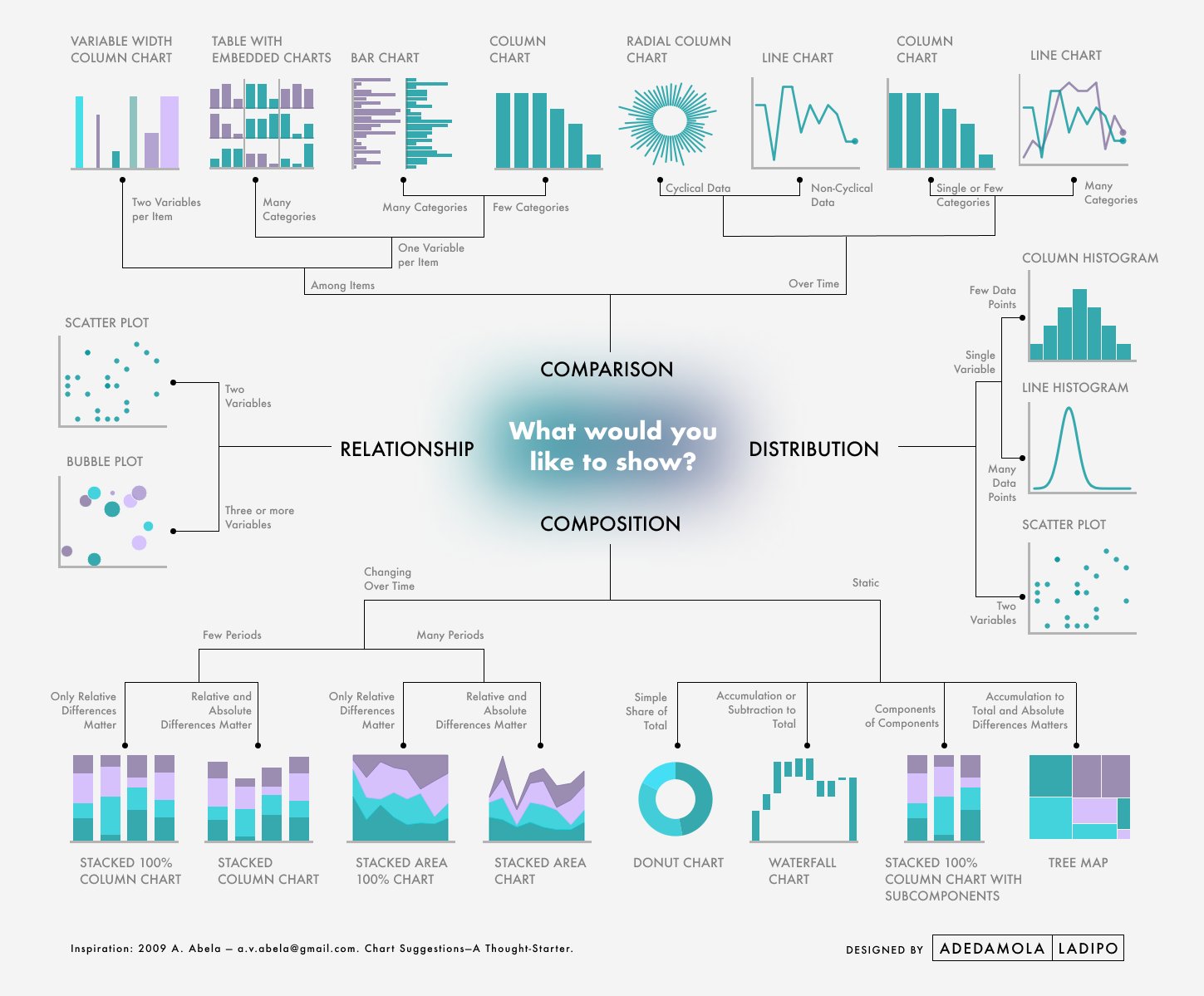
To make the selection of visuals easier, I always identify the main function. There are four functions that come to mind:
- Comparison
- Distribution
- Relationship
- Composition
I’ll give you three awesome guides to assist you in selecting the chart. To download them in PDF format, click on the images to be directed to the source.


4. Choose a theme and maintain consistency
The two main elements of the theme are the COLOR PALETTE and TYPOGRAPHY.
The purposeful use of colors enables the user of your panel to spend less time processing specific information. The goal is always to make the chart easier to read and to focus attention on what is truly important. Check out our blog Learn Win Users With the Right Colors in Ten Minutes to get more details about color usage.
Typography is frequently overlooked in dashboard development. Fonts can be classified as serif or sans serif. The dash or slash that appears at the end of letters is known as a serif. For more textual content, such as books and magazines, serif fonts are recommended. In smaller text, such as captions and labels, sans serif fonts are recommended.
When selecting a font, test it in the online environment – this is where users will interact with the Dashboard! I recommend sans-serif fonts. I frequently use the DIN font and Segoe Bold.
Last but not least, don’t forget about the pattern! Maintain consistency in the font and size of labels, titles, buttons, and so on. It is pointless to have a card in the same information hierarchy that is size 22 and another that is size 24. So, take care to select a font that works with all of the elements you’re using.
5. Create a personalized background
You can set up your background once the client has approved your sketch, color palette, and fonts are defined.
It must include everything that will appear on your dashboard as well as all navigation functions, with the goal of leaving as few elements as possible to insert into Excel or Power BI. The more “completeness” you have, the less work you will have to do in Excel or Power BI Desktop.
You can create a background by using
After creating your background, just export it as an image (preferably . SVG which preserves the quality)
6. Use icons and images to provide context
Icons, images, and the shape of a button, “empathize” with the context. These elements provide the best experience for the user when navigating your dashboard. This transitions from the initial overview (the first 5 seconds) to the interaction, where he will click, filter, browse…
There are several websites where you can get free icons and images. Here are some examples:
7. Arrange visuals and write with care
 The alignment of the visuals and the standardization of the spacing between the elements are critical to ensuring a pleasing aesthetic in the eyes of the users.
The Grid is the best way to achieve perfect alignment and spacing. Grids are created by dividing a portion of the user’s screen into equal parts with spacing between them.
Using this spacing, also known as negative space or white space, allows you to keep order, and emphasize key elements of the panel.
The key word here is consistency! Set a standard and stick to it!
It is also critical to double-check the grammar of all texts on the Dashboard. If something goes wrong, it’s your fault for leaving an English error in the title of a graph or forgetting to change the title of the graph that appears automatically. Please review as many times as necessary to ensure that no errors are introduced.
8. Use references to get ideas
When I first started working with dashboard reporting, I knew nothing about design and had to “learn” how to create visually appealing Dashboards for my audience.
The best way to “get the hang of” Dashboard Design is to be inspired by examples. Search Google for existing dashboard ideas. You can also get references from numerro.